Brand direction
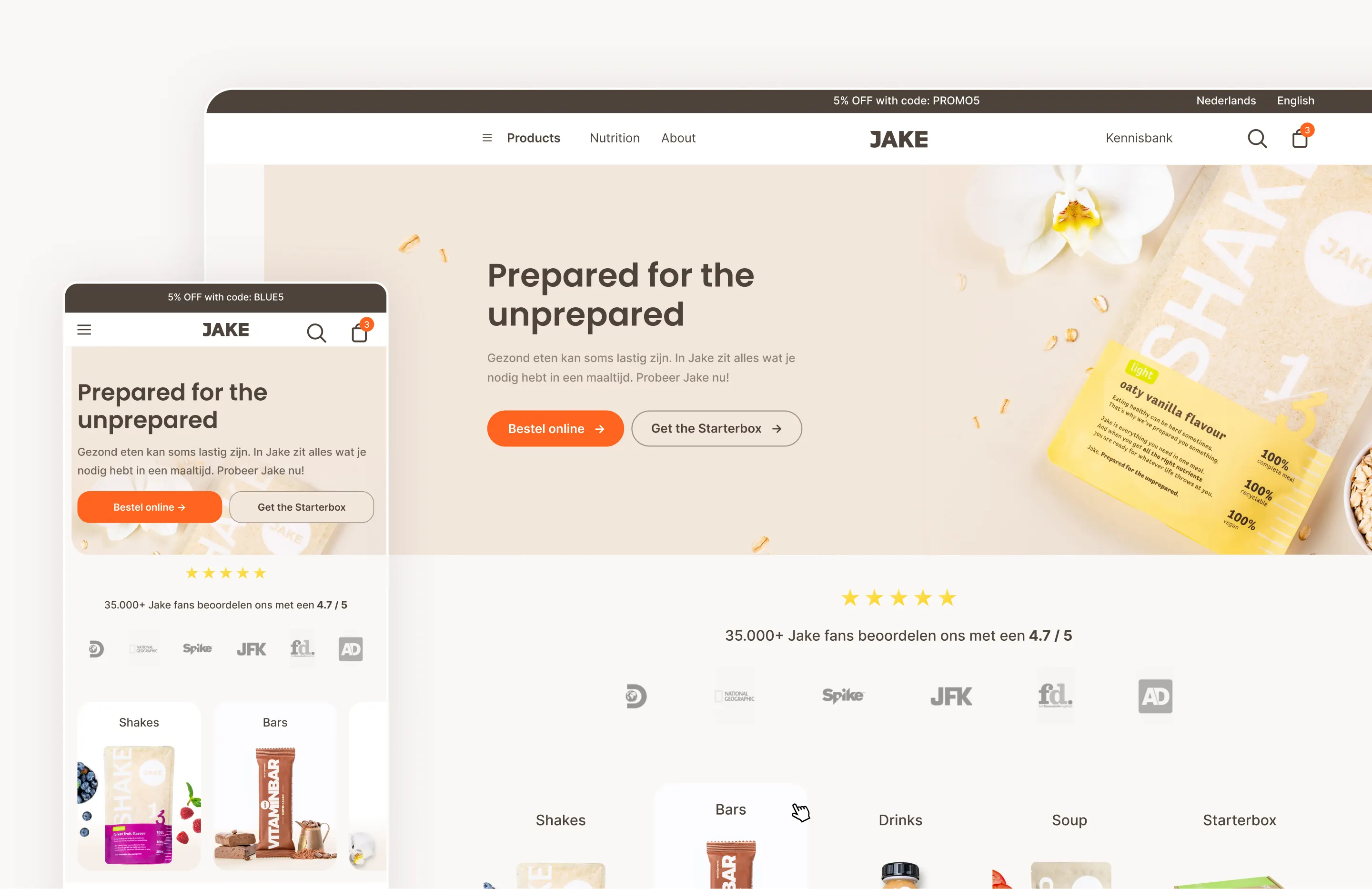
While JakeFood already had an established visual identity, it no longer matched the audience the brand wanted to reach. The existing website felt heavily focused on sports nutrition, with bold colors, harsh typography and a static interface that made the product feel less approachable.
Our goal was to tone down that impression without losing the brand’s identity. By introducing a lighter visual language, more breathing room and a friendlier interface, we shifted JakeFood towards a healthy meal replacement for everyday life instead of a product aimed exclusively at athletes.
Conversion
The redesign focused on reducing friction throughout the customer journey and making it easier for users to move through the website. We reworked the product pages, checkout flow and introduced subscriptions, with clear calls to action and a more structured funnel guiding users towards a purchase.
Conversion and user experience went hand in hand throughout the project. By making the experience clearer, easier to navigate and more engaging, the redesign increased conversion from roughly 3% to 8%.
Mix & Match
One of the more interesting challenges was redesigning the Mix & Match experience. The original page presented products in one large list, making it difficult to navigate and compare options.
Instead, products were grouped by category and combined into a clearer flow where users could select flavours and quantities while keeping an overview of their selection. This made the experience easier to understand while supporting a much larger assortment.
Scalable
JakeFood relied heavily on landing pages, comparison pages and SEO content. As the website continued to grow, creating new pages while maintaining consistency became increasingly difficult.
To solve this, we designed a component-based system that made it possible to build new pages from reusable sections instead of designing each one individually. This created a flexible foundation that kept the experience consistent.
Mobile-first
Since most users visited the site on mobile, it was designed mobile-first. Every page was simplified to keep navigation intuitive, reduce unnecessary clutter and make purchasing as effortless as possible, especially on product and checkout pages.
The same principles were carried over to desktop, keeping the experience consistent across devices while making sure everything stayed clear and easy to use.
Roles (4)
UX Designer, UI Designer, Icon Designer, Project Manager (minor)
Responsibilities
Together with another designer I was tasked to design the entire new JakeFood rebranding. I also acted as the bridge to external developers, ensuring the design was implemented accurately in WordPress.
Additional Credits
Made together as a small part of my internship at DSGN | Digital Agency. All shown pages and views designed by myself only.